Update (5/24/2022) – Ha
according to this all cellular announced last week, Google Has (Finally!) Updated the Web Version of the Play Store With more modern design, inspired by material uIncorporating various aspects of a virtual store, from smartphones and tablets to computer screens.
The testing has actually been going on since November 2021, and more and more users have started to notice the differences in recent days. now finally The novelty is widely distributed to all Internet users,
As you can see right away when you open the site, the icons are larger and the interface, in general, is cleaner, and uses distinctive Google typography as well as the company’s various other services. In the top menu, you can navigate between games, apps, movies, books, and kids pages, and also search by clicking the magnifying glass on the right next to your profile icon.
When browsing the Apps page, the Store now gives you direct viewing options Own apps for cell phones, tablets, TVs, Chromebooks, smartwatches, and even cars,
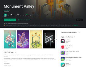
Another interesting highlight is the pages for each app. In the case of games, which have trailers and more engaging images, a banner containing the game’s main information features a vignette played automatically in the background, reminding what Virtual Console stores do to better showcase the product. .
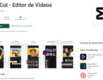
In the case of simple applications, the design refers to something previously seen on cell phones, now with a large icon on the right and information on the left. interesting, however, By web version, it is not possible to see the size of each app in their respective notice sheets. It still shows up in the Play Store on mobile devices.
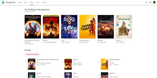
Other sections, such as Films, also received improvements, highlighting the premiere, which increased content and also provided an organization of work by responsible studios. Similarly, the Books section separates eBooks from Audiobooks.
And you, what did you think of the new look of the Play Store? Leave your comment!
Original text (5/17/2022)
Google Is releasing a design update for the web version of the Play Store this Tuesday (17). After many years without receiving major changes, the website of the official store Apps Taking a brand new look and feel to match the mobile version for Android, incorporating many elements material you,
website visual language Gets many features from the mobile version, like buttons and icons with rounded edges, search filters, and more prominent titles. The gray background has been replaced with white and will likely receive support for dark mode, All the elements bring a more modern look than the “square” look of the old site.
(Images: Playback / Android Headlines)
The organization of the apps has also been optimized for the current titles most commonly used by the public. Users will be able to find additional categories like “Streaming”, “Productivity” and “Education” on mobile, tablet, TV. Chromebook and other devices running the Google operating system.
Interestingly, the “Play Liveros” and “Play Films” sections continue to adopt a more quadratic format for title covers, but have received divisions that announce promotions, commemorative events, and other platform news.
It’s one of the new revelations that brought big tech this Tuesday. This morning, we reported a google play system update, which added a new parental supervision tool to Family Link. By the way, the month of May has already been the stage of new cell phone presentation And artificial intelligence solutions Signed by Google.
The Play Store is slowly getting the design update, and for now, it’s limited to a select section of users of the platform.
What do you think about the new look of the Play Store? Has it come for you? note!
See more!
(Updated May 16, 2022 at 4:00 PM)


